These pages will lead you through an old picture book. It was first published seventy-one years ago in Hamburg, printed in hundreds of thousands of copies and distributed all over Germany; it was much read, much admired, greatly loved by children, especially those who grew up after the war when picture books were scarce. But this book has not received the recognition due to it, and today it is almost completely forgotten.
Tales of the Nations is the work of a narrator and illustrator who never made a second public appearance, neither as an artist nor as a writer, at least not under the name Stefan Mart. Searching in libraries, browsing through reference books and old exhibition catalogues brings nothing to light. The name Stefan Mart does not occur anywhere except in lists of old books compiled by meticulous antiquarians. And even here it is never associated with any other work except the one volume published in Hamburg in 1933.
Yet Tales of the Nations is not a rare book. Copies are quite frequently put up for sale by sellers of old books, though mostly without any mention of the author and illustrator. On looking more closely at a copy one understands why this is so. The cover, embossed with gilded letters, displays the title but not the author's name. Where one would expect to find it, above the title, there is a vignette. 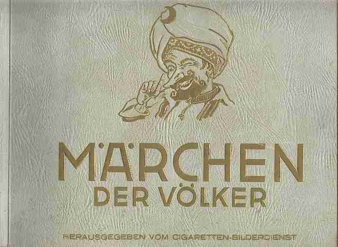 One has to open the book and turn over a few pages before one realises that it is not just a compilation of stories by an anonymous editor but the work of an individual author. One single laconic line under the preface reads: "Stefan Mart, January 1932", whereas on the lower section of the title page we find: "Edited by The Cigarette Picture Service Hamburg-Bahrenfeld". The reader is left with the impression that the book comprises texts of various origins compiled by its editors. The vignette reinforces this impression as it shows the head of sombody who is obviously telling a story, mouthing words, raising his index finger and has one eye closed in a sly wink. The huge turban is that of one of the book's main characters, Sindbad the Sailor, teller of the story of his seven adventurous journeys, caricatured as an agile little man endowed with the long pointed nose of the curious.
The mythical storyteller, it seems, has come to usurp the position of the factual author. Or does the latter rather use Sindbad as a mask, a persona to add more weight to his words? What, then, is the meaning of the face Sindbad is making, and why is he winking? The meaning is not difficult to guess; the author conveys it quite openly in his preface: "What the readers need to do is to suspend their rational minds, to send them off on holiday." In other words: we are supposed to suspend our adult disbelief and, like children, let ourselves be willingly carried away by our imagination. The reader of Tales of the Nations should be prepared for a good deal of mystification.
Of course, the Sindbad of the vignette is also an advertisement and - what else could he be advertizing but oriental cigarettes? His loquacious head enhanced by turban, golden crescent and curly beard promises the reader all the perfumes of the bazaar: incense from Jemen, sandalwood from India and tobacco from Smyrna, commodities that resemble Aladdin's djinn in so far as they all dissolve into blue smoke. This explains why a cigarette manufacturer should have had the idea of publishing a volume of fairy stories, and why a great work of art was never recognized for what it was. Stefan Mart's book made its public appearance in a manner quite unusual for works of art: it came incognito so to speak, as an ad, a collector's album for cigarette cards. This is why it was mass produced and distributed all over the country. But what made the book ubiquitous also prevented the author from being recognised as an artist and thus consigned him to oblivion.
The picture series comprises 150 colour prints 7 x 10.5 centimeters, to be pasted into an album of 118 pages which was available in quarto format, both as landcape and as portrait. The album contains a preface by the artist, 22 tales and more than a hundred additional monochrome drawings (pen-and-ink). It could be bought at the local tobacconist's while the colour prints were exclusively supplied by the Cigarette Picture Service in Hamburg. To obtain them one had to collect the gift vouchers that came with the cigarette packages manufactured by Reemtsma & Co and send them to Hamburg. The picture cards each had a serial number and the title of the tale, but contained no legend. If collectors wanted to understand a picture in the context of the tale it illustrated, they had to buy the album.
Early in the 19th century, manufacturers of semi-luxury food and tobacco products started issuing coloured pictures as free gifts. On its website the German-based Antiquariat Köberich offers a succinct history of this method of sales promotion, which has created a whole universe of collectors' items. An entertaining and detailed account of the pictorial output of German cigarette manufacturers, especially Reemtsma, is given by the British cartophile Stuart Arnold on his website German Cards.
The company that carried out the four-colour printing of the picture cards is not mentioned, neither on the cards nor in the album, but at least we know the name of the printer of the albums produced in landscape format: Poeschel & Trepte in Leipzig. The proprietor of this company, Carl Ernst Poeschel (1874-1945) himself a renowned editor, book artist and bibliophile, designed the layout and typography of the tome. During an air raid in 1943 Poeschel's entire printing works and archives were destroyed in the flames and only months later the office block that housed the Hamburg Picture Service - a former garrison - was also reduced to rubble. This means that all the records which could have furnished first-hand biographical information about Stefan Mart, his training and artistic career have been lost forever.
 Tales of the Nations is presented in the author's preface as a book for children and adults. It offers a colourful mixture of folk tales and literary fairy stories, myths and fantastic legends, even including a novel. Some stories such as Sindbad the Sailor and Don Quixote are simply re-told; others such as Master Flea (by the German romantic poet E.T.A. Hoffmann) and Hop Frog (by E. A. Poe) have been modified; and then there are the author's own inventions. One of the latter is Bobby Box a modern cartoon story which the author presents as his own, though this does not prevent him from calling the same story elsewhere "an American tale".
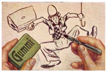
 On the other hand is it hard to conceive of a more American fairy tale than this one, as America made a decisive contribution to the hoard of fairy lore with the invention of the animated cartoon.Pictures that suddenly come alive have always been the stuff of myths and legends; now, in the industrial age, they attain a precarious reality as movies and animated cartoons. One of these animated cartoons is Stefan Mart's comic hero Bobby Box, a chaplinesque clown. He springs into being as a young designer's brainwave who sketches him with crayon on the wall of his miserable garret dwelling.
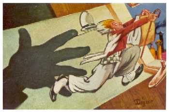
 When he approaches the figure with a duster to wipe it off, it runs away across the roofs of Greenville town to the Wild West. Bobby survives all sorts of dangers, is turned down by the girl he loves, returns to his creator and furnishes him with the material for a great cartoon series. When the artist sells his work, it earns him just the few dollars he needs for a hot meal. -
The irony of this ending could be an indication that the story is autobiographical. Stefan Mart would certainly not have been the first author to incorporate the troublesome history of a work into the work itself. The lack of information about his life makes us naturally prone to interpret the half starved artist of this story as an alter ego of the author.
When he approaches the figure with a duster to wipe it off, it runs away across the roofs of Greenville town to the Wild West. Bobby survives all sorts of dangers, is turned down by the girl he loves, returns to his creator and furnishes him with the material for a great cartoon series. When the artist sells his work, it earns him just the few dollars he needs for a hot meal. -
The irony of this ending could be an indication that the story is autobiographical. Stefan Mart would certainly not have been the first author to incorporate the troublesome history of a work into the work itself. The lack of information about his life makes us naturally prone to interpret the half starved artist of this story as an alter ego of the author.
The bubbling freshness of imagination that is evident everywhere in this work does indeed suggest a young author. Furthermore, the 1920s and 1930s were tough years for German writers and artists, especially for those who had yet to make their name. But if the illustrator did have reason to complain about bad wages and if the poet and storyteller did resent having to harness his Pegasus to the advertizing cart, neither of them let it be felt in the work. However grim the external circumstances may have been, internally the work is a unified whole, well balanced in all its parts; it is by no means a pot-boiler produced by an unwilling and hassled hand. Stefan Mart gave his best: without exception each of the 150 colour illustrations exhibits his full ability. It is the high degree of originality of these pictures, their inimitable hallmark which sometimes even induces doubt as to whether they are in fact the work of a young man. Given their uniqueness, it is unlikely that the illustrator of Tales of the Nations in later years created other works under a different name and in different circumstances that gained him recognition. Had he achieved fame as a German painter - and he certainly would have had the talent to do so - and had he for some reason wished to disown his early work, he would not have succeeded: his hallmark, his artistic fingerprints would have betrayed him.
Needless to say, when nothing whatever is known about the life of the artist, all possibilities must be considered. It is quite probable that the author of Tales of the Nations published under a pseudonym. The first name appears in two versions - in the preface it is Stefan while in the publisher's note it appears as Stephan. Only a misprint? Perhaps. But it could also be that it is a nom-de-plume which, like a new shoe, does not quite fit. However, there are more serious inconsistencies: 24 of the 250 illustrations bear a signature, and the artist's name is clearly legible as Digeer.
 This undermines the assumption that author and illustrator of the stories are one and the same person. The author's preface and his note about the sources of the tales only make references to the texts and say nothing about the illustrations. The identity of writer and illustrator is never explicitly stated except in the publisher's note of the edition printed by Poeschel & Trepte, where it says: "The stories were re-told or newly invented and embellished with colour pictures or black-and-white drawings by Stephan Mart". It is not easy to determine how much weight should be given to this statement concerning a book where the author does not figure on the title page, his first name occurs in two different versions, and a number of pictures bear a completely different name. Given these inconsistencies, one can no longer take the identity of narrator and illustrator for granted.
Suppose for a moment that some prominent artist by the name of Digeer had reason to keep his authorship of Tales of the Nations a secret, and therefore adopted the name Stefan Mart. Why, then, should he have signed some pictures with his real name? Did he only hit on the idea of hiding behind a nom de plume when the colour card series was already being printed and it was too late to change all the stereotypes? All of this is unfounded speculation. And just as the name Stefan Mart is not to be found in any directories or catalogues, neither is that of Digeer, so if there was an artist of that name, he has left no trace.
Nor is the theory convincing that there are two people involved - one illustrator and one narrator. That possibility cannot, of course, be excluded since we have no documents or evidence proving that the book is the work of one individual, but it is unlikely. First of all there is a high degree of correlation between the pictures and the narratives, both with regard to their dramatic nature and their style. Stefan Mart writes as he paints: his language is capable of evoking astonishing images, as the reader of the Preface will find. Secondly there is what one could perhaps term a "weighting of talents". It is characteristic of artists with several creative talents that one of these tends to dominate. The creator of Tales of the Nations is first and foremost a graphic artist and painter. He reaches the highest degree of professionalism in the field of illustration. In comparison with this, his language - despite its wealth of nuances, powerful images and liveliness - is poetic, but not that of a real writer. The well-read young man is somewhat lacking in polish, in brilliance. Like uncut diamonds, the stories contain flaws: they are not as stringently organised as are the pictures with regard to ideas and language. The reader may find the inflationary use of exclamation marks tedious; one could also take exception to several passages concerning their political correctness. (These have been quietly cleaned up in the present version). The benevolent reader will overlook all of this and attribute it to youthful naivety or casualness. However, there is never any need to apologize in any way for any of the pictures. So it would seem that the stories of Tales of the Nations are the work of painter who had also taken to writing; they are endearing and can indeed command respect as wondrous legends for admirable pictures which, however, do not comply with the same strict standards. If one had to choose between them, and to opt for either text or pictures, one would not find it hard to take a decision, as the stories can if necessary be reconstructed through the pictures, but not vice versa. This in no way disparages Stefan Mart's literary work: it simply puts things into proportion.
In attempting to characterise the hallmark of the illustrator Stefan Mart, one must begin with the genre he chose as his artistic "weapon": Stefan Mart is a caricaturist. Only late in the 19th century were caricaturists fully recognised as artists in particular on account of the work of two Frenchmen, Gustave Doré and Honoré Daumier. The rise of the caricature was due to technological as well as political and social factors. It would have been inconceivable without the politicization of art in the wake of the French Revolution on the one hand and without innovations in printing, on the other, which made it possible to reproduce caricatures in large numbers and thus make them accessible to the mass newspapers.
It has been said that art needs the caricature in order to eliminate what is glossed over or glorified in painting, and to pay tribute to the truth with striking brush strokes. The caricature is in principle a graphic artform still with a whiff of printer's ink about it. It is black art, black-on-white art in both senses: it is loud, self-opinionated, insists on facts and, in the heat of the moment, can simplify and reduce everything to black-and-white. To caricature is to exaggerate, to overemphasize what is characteristic and the discrepanices between the ideal and reality. In their quest to seize on what is characteristic, caricaturists are even prepared to annihilate the ideal through laughter. If it is true that laughter is located in a very ancient stratum of human and also animal behaviour - namely as a cry of triumph - this would fit the picture and cast a somewhat dubious light on the desire to mock and hold people up to ridicule which the caricaturist indulges in with such gusto. Like children and fools, they speak of those things which the well-bred have been taught to overlook: human weaknesses, physical defects, divergence from the human ideal or what the period defines as such. In their work they are insensitive to the pain they cause when they puncture people's vanity. That is why they have gained a reputation for cruelty, even of misanthropy.
When they defend and present themselves as philanthropists, caricaturists like to argue that they have undertaken to unmask the hidden falseness of facial expressions, poses and gestures. Whether that is a mere excuse must be investigated from case to case. It cannot be denied that, as they developed into graphic artists, they abandoned the triumphal crudeness of the lampooner. They increasingly produced studies of human souls caught in illusions, conventions and fears - to be seen in the works of Honoré Daumier. The aggressive triumphant tone disappears, the laughter is modulated from the major to the minor key, becoming softer, darker; anger gives way to mourning. But there is no conversion to positivity, rather progress towards painful knowledge. The caricaturists remain irreconcilable opponents of the fraud and infamy of the world. They grimly hold on to their ammunition: that is to say to those tools of the trade that they have learnt as journalists and supporters of political parties, as mockers, satirists and polemicists - they still have their arsenal of exaggeration techniques at their disposal. But now they hone these and use them to comprehend and to analyse; they no longer use the crayon as a dagger, but as a scalpel. Anybody who wishes to create a dictionary of human facial expressions and body language would be well advised to begin their studies with the great caridaturists, to scrutinize those works. They put human expressions and gestures under the microscope; they exaggerate in order to clarify; they defamiliarize in order to make us understand.
The caricaturist Stefan Mart studied the great masters of caricature, as one can see from his pictures. The pioneers preceded him by two or three generations. A revolution had meanwhile taken place in the world of images. Photography, colour picture prints, half-tone printing, four-colour printing, cinematography had developed into industries competing with the traditional craft procedures of picture production. The artists saw their livelihoods in jeopardy, try to regain the initiative, to adapt to the new role of the image in society. Some despaired of the century-old principle of mimesis or imitation of nature, abandoned it and opted for new radical ways of seeing and painting, for creative freedom in playing with abstract form and colour, for the recognition of emotional truth and formal precision as the criteria for art. Others were shocked by this and accused the innovators of cultural Bolshevism, violation and mutilation of the beautiful, of creating a perverse doctrine: foul is fair and fair is foul. The witches' cauldron began to boil and bubble; politicians began to invoke what they called the good sense of the man in the street "das gesunde Volksempfinden", and to urge him to take action. The "ordinary man" on the Berlin omnibus regarded the new painters with suspicion and hostility. In 1933 such attitudes became part of the ruling ideology; the resulting dictatorship persecuted modern artists, forbad them to exhibit their pictures, and denied them the right to work.
In 1939 Tales of the Nations disappeared from the list of the Hamburg Cigarette Picture Service. Its place as No. 4 in the series of collectors' albums was taken from then on by "German Fairy Tales". The previous year Album No. 2 "Modern Painting" had been removed with its pictures by Cezanne, Gauguin, Van Gogh and German Expressionists, whom the Nazis considered "degenerate". These works were replaced by "Gothic and Early Renaissance Painting". This is an indication that Tales of the Nations was a red rag to the authorities, all of whom were subordinated to the Nazi propaganda ministry. The title page could be understood to be promoting cosmopolitanism, international understanding and respect for the uniqueness of all cultures. The texts likewise. Stefan Mart admired the cultures of enemy nations: the Anglo-American and the French. Three of Mart's own tales clearly demonstrate this: "Bobby Box", "M'sieur Bonbon" and "That's Success!". On the other hand, the enthusiasm demanded by the Nazis for things national and German was quite alien to him. Their cultural officials must have found his illustrations offensive. Though these pictures were quite unpolitical, as caricatures they belonged to a genre which the new rulers feared and hated. All the more so as caricaturists felt at home in modernism, understanding and adopting its use of forms quicker than artists of other disciplines. They had, after all, initiated the development of these forms or, as the Nazis saw it, had had a subversive influence, had contributed to the degeneration of art.
 It is above all Stefan Mart's coloured illustrations that are modern. Though he works with the colours and colour shadings of the classical painter's palette, he has a preference for strong saturated tones. In all his pictures clearly delineated aereas of strong, indeed glaring colours contrast with each other. Even shadows of objects and figures are radiantly coloured. He outlines contours of faces and buildings in bright red or brown. The dark brown studio tone is not to be found in his pictures, nor are the shimmering lights of plein air painting.
 One could consider this use of colour loud; but its purpose is not simply to impose a message on the viewer. The unnatural yellow, orange-coloured, red skies before which Mart likes to place his figures express strong emotions; the artist borrowed them from Gauguin and the German Expressionists. Buildings, foothills, whole landscapes glow in these warm radiant tones as though they had been submerged in the light of tropical sunsets. In the same way the cool colours blue, turquoise, green bear witness to a desire to roam in distant exotic worlds, to go to sea, to the south seas, far into the infinite ocean of the air. But even his natural sky-blue - as seen through a skylight,
 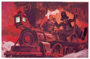 or the window of a train compartment or, fluttering with little white heat-clouds, vaulting up over the head of lovesick Don Quixote - even this is so striking that one feels one has never seen it before.
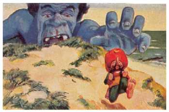
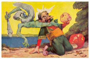
The choice of colour becomes truly phantastic when in the stories disaster is looming: black violet thunderclouds over a green sea whipped by the raging storm, a collossal blue cannibal behind a yellow sand dune stretching out his hand after a man running for his life, a green sea demon with steely gray beard tormenting a shipwrecked sailor, an overheated steam engine tearing through a landscape that is shrouded in ghastly red. These are all pictures containing an element of mockery of the shock-effect to which modern painters were so partial.
Many caricaturists experimented with colour; some were outstanding painters; few created paintings of lasting value which maintained elements of caricature, as did Daumier in his picture cycle on Don Quijote. Stefan Mart's illustrations are no mere coloured drawings. In his work the colour is fully integrated into the composition of the picture. It is not too much to say that every third picture of his is a little masterpiece with regard to composition and colour. They are all without exception based on a harmonious pattern of motion which assumes an independent existence, takes over the domain of light and objects then returns with the colour and substance attained there to re-enter the two dimensions of the canvas or drawing pad. Whether the artist intended the tale of Bobby Box to serve as a metaphor for the creation of his pictures, we do not know. But in each of them a silent music becomes evident made up of coloured lines and surfaces, which entertains and pleases the eye before it has begun the equally pleasant task of recognition of scenes, people and action.
With regard to the drawing of the pictures, including the caricaturing exaggeration, Stefan Mart follows tradition. Here too his achievements are astonishing. As well as the great caricaturists, many other good spirits of European painting seems to have come to his cradle to present him with gifts.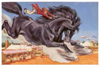 This (presumably) young cigarette album illustrator is an erudite man: he is familiar with a large number of paintings; he ironically cites styles of painting and motifs; he takes the liberty of parodying them. He knows a great deal about costumes, architecture, he is sufficiently well-versed in all the traditional fields of painting to be able to produce excellence: in genre paintings, landscapes, seascapes, still lifes, anatomical and - essential for the caricaturist - animal studies. He can effortlessly create the form of a powerful gleaming black stallion; but he also makes a wonderful job of the old nag Rocinante. All this knowledge and these skills seem to have come naturally to him, and if he trained at an academy - which is most likely - his teachers must have thought highly of him.
 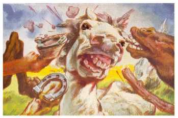 However, he was perhaps somewhat too independent and maybe also too extravagant for an academy. He gave of his very best as though that were just good enough for a cigarette company picture series. The director of the Hamburg Picture Service with his art-educational commitment could not have found a better man for the job. Nor a more conscientious painter. He worked with extreme discipline when it came to the rendering of difficult details: the surfaces of water and stone, folds in clothing, light and shadow, anatomical structures. The illustrator of a narrative produced for a mass audience could not have run the risk of abandoning the treasury of figurative means of representation accumulated over centuries for radical reduction to pure colour and form. Yet Stefan Mart remains a child of modernism. His predilection for unreal perspectives, the grotesque and outrageous, links him with its predecessors in manneristic painting. In this the illustrator of Tales of the Nations comes closest to the Surrealists. Max Ernst, Salvador Dalí, René Magritte all maintain traditional figurative techniques of representation, which they adapt for their own purposes, detaching them from the context of the old representational purpose of imitation of nature, and aiming at the phantastic recombination of the visible world.
Mannerism in art and grotesque sculpture are the ancestors of the artistic caricature. - If it is true that in the 19th century these developed into an almost academic analysis of expression and gestures, then cartoons in the 20th century might be said to be the commercial application of such analyses. The cartoon can be defined as a programme regulating deeply-seated emotions through our sense of vision. Together with other branches of the kitsch industry, cartoon productions make frequent use of a model which psychologists call the "Kindchenschema" or "baby face": a high, strongly domed forehead over a pretty little nose and a little doll's mouth and chin. Many Walt Disney characters have such baby-faces: Mickey Mouse, Bambi, Dumbo, Tweety, including clumsy Pluto. This pattern triggers our nurturing and caring instincts, and it does so with people of both sexes. Experienced cartoonists can use it to play on the emotions of their audiences. Just as certain keys produce certain notes via the mechanics of a piano, so too visual stimuli can give rise to emotional reactions with people being amused, touched, afraid, angry - all on the basis of optical signals. That may explain why a cynical mass manipulator such as Joseph Goebbels, to whom everything un-German was otherwise anathema, was a Walt Disney fan.
It would be unfair to Stefan Mart to mention him and Disney in the same breath. But sweetness, drollness, grotesquerie and even cruelty are simply part and parcel of children's tales. Tom Thumb and his like are small but smart; the barbaric giants of the folk tales were thought up long before the toons put on paper by Stefan Mart. It was surely their colourfulness and liveliness that made his pictures so popular with children. But children do not distinguish between content and form. They loved Stefan Mart's clowns, fools, dreamers and children of fortune: Sindbad rowing for his life on the ocean waves in the dark of the night accompanied by luminescent creatures of the sea; Dilldapp, nestling up against his benefactor, the dappled monster; Bobby Box patiently holding the mirror for Marygold as she gracefully combs her blond hair; a Happy Young Couple attired in Chinese silken robes listening to the song of the nightingale in a garden illuminated by lanterns and the moon; a beaming Mr Peregrinus at the Christmas market anticipating the joys of the coming festive season; the impudent Thread Devil balancing on the sentinel's sword and cocking a snoot at him; Don Quixote avidly reading large tomes of knights' tales by candlelight; Councillor Knapp wading through the mire of a poorly lit lane wearing the galoshes of fortune; Captain Flint in the chaos of his cabin trying to make himself a glass of grog: How profoundly the artist empathizes with his characters, becoming oblivious of himself; what an unerring instinct he has in the representation of their facial expressions and gestures, how strong, therefore, the direct impact on our emotions.
In describing his characteristic hallmark, one must also mention those factors which prevented the full development of his potential. The pictures were of course handicapped through being playing-card sized book illustrations, even if the original setting copies were very much larger than the prints. But it was not so much the format which acted as a fetter but rather the medium of the stationary image itself. Many pictures of Stefan Mart's try to break free of this restraint, attempt to set themselves in motion, to become cinematographic - for instance in the story of Bobby Box. Their creator seems to have a dream, perhaps even an ambition: his energies are directed towards the film. It is no coincidence that the last long tale in the storybook deals with the cinema. It bears the characteristic title: "That's Success!"; with the subtitle: "A modern fairy tale".
Around the 1930s in Germany animated cartoon technology was still in its infancy and was to remain so. But it would be difficult to imagine the illustrator of Tales of the Nations as director of a company with elaborate division of labour, the supervisor as it were of legions of drawing slaves.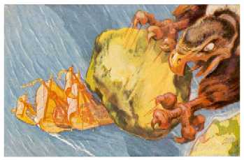 He was too much of a romantic to become the founding father of a German animated cartoon company. At any rate, his dream remained a dream - which was beneficial for the storybook. Because it has left its mark on many of the pictures. Stefan Mart is the film director at his own easel. With nothing else to guide him other than his imagination, he paints as though he were taking panning shots like a camera man. He seems to think in terms of takes: complete shot, medium shot, close-ups. He is particularly drawn to the challenge of presenting scenes from the bird's-eye perspective. In one of his most splendid pictures the observer hovers above the high-flying Roc Bird, which is just hurling a boulder torn from the cliff down on to Sindbad, who is trying to flee. We look down almost perpendicularly on the ship under full sail that is desperately trying to escape from the huge shadow of the bird of prey but fails to do so. It is a truly prophetic image ominously anticipating approaching disaster.
It is a distressing thought that the originals of these phantastic pictures have probably been lost forever.
1. To give the book Tales of the Nations a new lease of life in the internet
2. To search for traces of its narrator and illustrator.
With the creation of the domain "www.stefanmart.de" and the publication of these pages the first part of this project has been realised. As web publications can be enlarged and updated without much trouble, they can never really be considered completed - unlike books. No doubt the time will come when the present HTML version of Tales of the Nations will have to be modified in order to comply with new internet standards and avail of new technical possibilities.
With regard to the second aim: the present writer's attempts to find traces of Stefan Mart have so far been unsuccessful. This is why the book has been put into the internet. Everybody is welcome to join in the search. Any information you might have can be entered into the Guest Book and would be much appreciated.
Screen: 1024 x 768 Pixel True Colour (32-Bit)
The reproduction of the colours depends to a large extent on the type and setting of the screen. On liquid crystal screens (laptops) the pictures appear to have been sprayed with silver gilt, which reduces their effect. On older screens they often have a red, green or blue cast which cannot be eliminated. But the colour adjustment is not easy even with more modern screens and requires patience and technical know-how. Since the reproduction of the colours also depends on the quality of light in the location, it is advisable to calibrate the screen and to create colour profiles for daylight and artificial light and for different purposes. This too is something for advanced users. The internet forums are helpful: perhaps not so much for quick access to advice but rather for an understanding of the complexities of the problem.
Browser: Zoom 100 %
This is the default value, which can easily be altered in the browser menu "View" in order to adapt the type size to one's personal requirements or to improve the line makeup, which can be necessary for small screens.
It is difficult to reproduce book format in HTML. Here only the "justified" type of text-alignment of the original has been maintained, although browsers sometimes have problems with it: they "wrap" the lines at the end of words unable to cope with automatic syllabification at the end of lines, which is why unwelcome gaps frequently arise on the lines in the monitor. In the book, the colour pictures are surrounded by texts which are alternately aligned to the left or to the right. That is also how they appear on the browser. One further characteristic of the 1933 book of tales has had to be sacrificed: the text is reproduced in one single column whereas the original was set in two to facilitate reading.
Stefan Mart's pen-and-ink drawings are in different shades of grey. In the book these shades are rendered by a printing method called "halftone": the picture is resolved into a regular "screen" or grid of fine lines or tiny dots. Depending on the size of the printed dots, an area of the picture appears to the eye in halftone, i.e. in a darker or lighter shade of grey.
Scanners, which process a printed page for its display on the monitor, also resolve it into a grid of tiny dots called "pixels". But the two sceens, the grid of printed dots and the grid of pixels interfere and give rise to strange patterns - for instance like the checks of a Scottish plaid - where the eye should only see a uniformly grey area. These patterns or "moirés" can be quite irritating. It is difficult to avoid them where printed pages have to be scanned. But one becomes accustomed to them and after a time the eye adapts and interprets the checquered areas as simple gray.
The colour prints of the storybook are four-colour prints in the quality of good-class magazines. They were probably printed on simple white paper, rather than on art paper. Nothing is known about the graphic and painting techniques used in the setting copy procedures.
The HTML-reproduction of the tales has one advantage over the printed book form: Provided the screen in use is well adjusted and is not a liquid crystal screen, Stefan Mart's colours appear more radiant than on the white paper of the albums. But this is ultimately the work of the cliché maker and printer. Even the best scanner cannot extract more from a picture than has been put into it.